

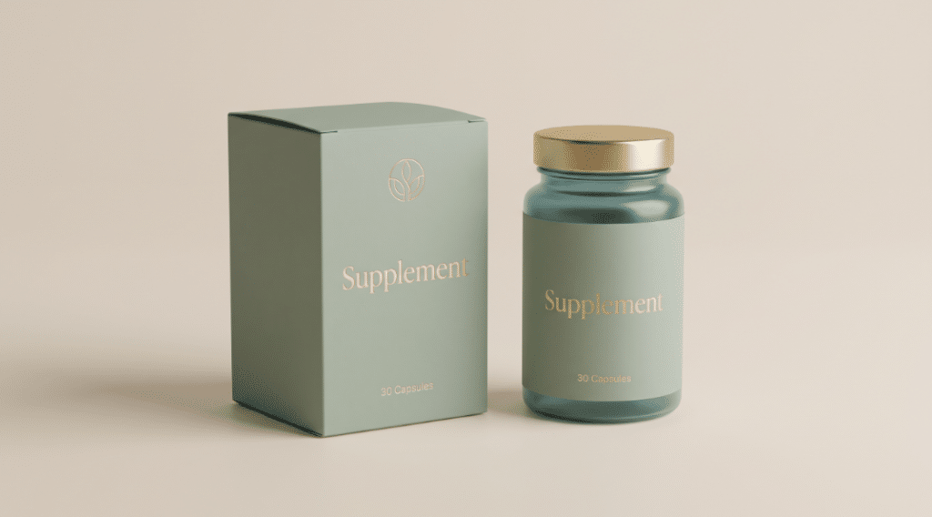
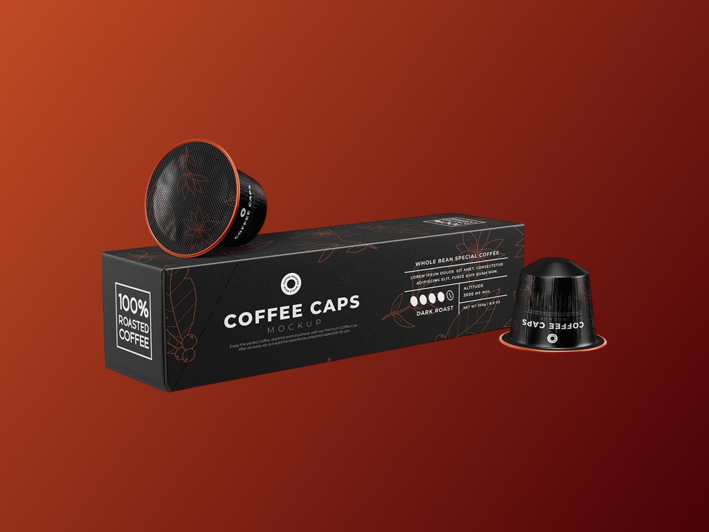
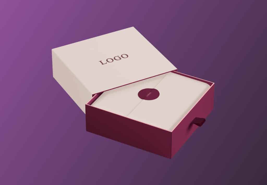

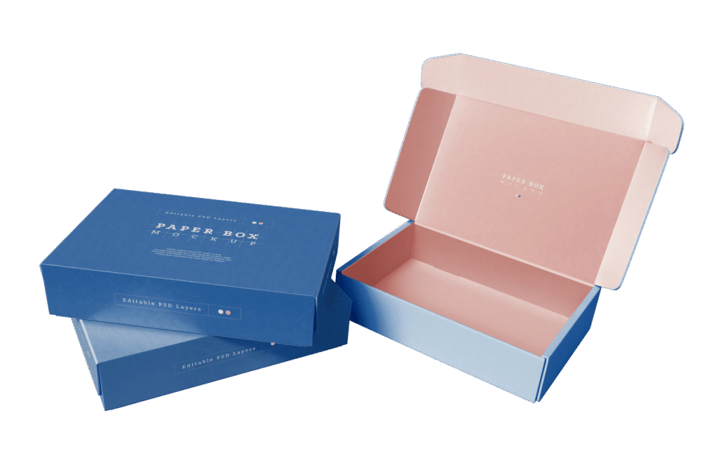

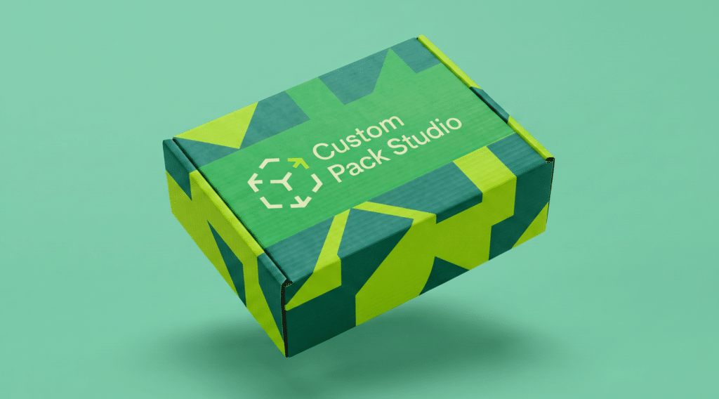

Your packaging is the first thing a customer touches. Before they see the product, they see the box. The colours, the feel of the card, the way their eyes move across the design. All of it shapes how they feel about what’s inside.
Good packaging design doesn’t require a huge budget or a graphic design degree. It requires clarity about your brand, an understanding of how print works, and the discipline to keep things simple.
Here are the design decisions that matter most.
Start with your brand, not a template – Advice by Glasgow Custom Packaging Professionals
The biggest mistake small businesses make with packaging design is starting with a box and trying to decorate it. The better approach is starting with your brand and working outward.
Before you open any design tool, be clear on three things:
- Your exact brand colours
- Your logo in a high-resolution, vector format
- Your brand fonts (one or two, not five)
These three elements should already be defined from your wider branding. If they’re not, sort them out before touching your packaging. Customers notice everything. Packaging designed without consistent brand elements looks disconnected from your website, social media, and marketing materials, and it can be a bad look for your brand.
If you have a brand guide, make sure to share it with your packaging supplier or designer. It saves everybody time and prevents guesswork about which shade of colour you really need.
Colour on packaging design
Colour is the most powerful visual element on any piece of packaging. It catches the eye first, triggers associations, and creates mood before anyone reads a word.
Choosing colours for print
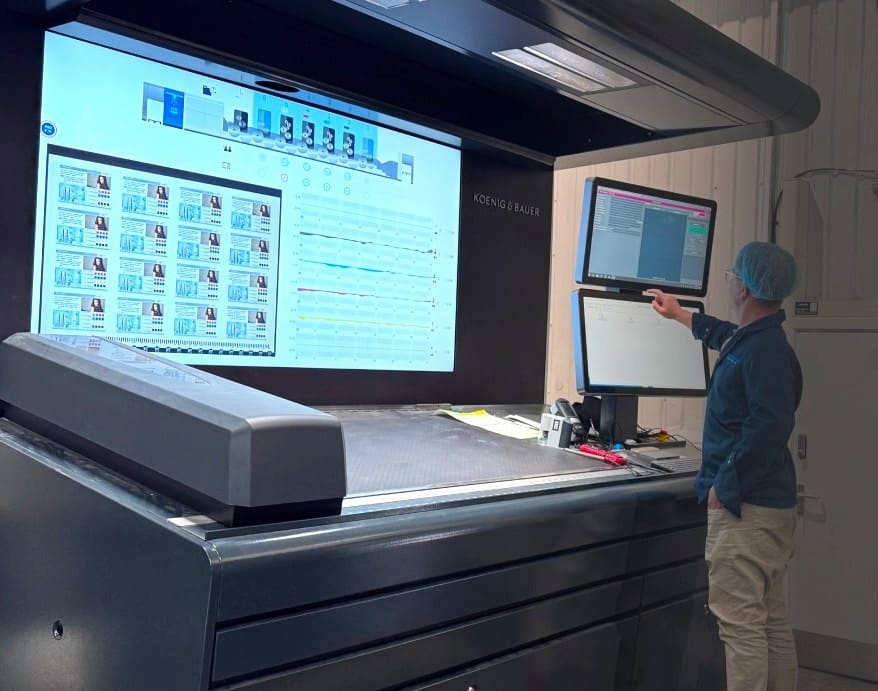
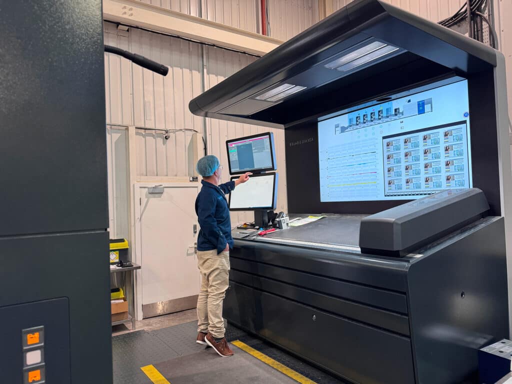
This is something that can surprise people whenever they are designing product packaging: the colours you see on screen won’t look identical when printed on card. This is because screens emit light. Printed card reflects it. This means colours can shift, sometimes significantly.
If you’re designing on a computer, always work in CMYK colour mode, not RGB.
RGB is for screens. CMYK is for print. This means designing in RGB and converting later can result in colours looking duller or different than expected. By switching to CMYK from the get go, and you’ll have a more accurate packaging material preview.
If your brand has a specific colour that absolutely must match, tell your supplier. They can use spot colours to hit the exact tone rather than trying to reproduce it through CMYK mixing.
Colour on different card stocks
It’s not just the software you use, but the card you choose!
White card gives you the truest colour reproduction but kraft (brown) card changes everything.
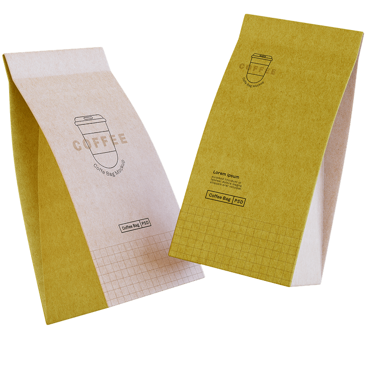
Printing on kraft means every colour is influenced by the brown background. Whites become translucent and light colours wash out. When choosing kraft card, go for dark colours and bold designs. If your brand uses pastel tones, kraft might not be the right base, no matter how much you like the natural look.
It is important to also factor in that different card options have different costs. If you are designing on a budget, you can always ask your supplier for printed samples on your chosen card stock before approving the full run. This will help determine which is best for your brand, and let you do a test-run before committing to the design of your product’s packaging.
Typography that works on product packaging
You’re always limited on space with packaging. Your text needs to work at close range to supply important information, as well as from further away to stand out on the shelf.
Font size
The most common typography mistake on packaging is text that’s too small. You want to tell a story, but you need to be mindful of the limited room.
Luckily there are some common guidelines to run by.
On paperboard, anything below 6pt becomes difficult to read. On corrugated board, the textured surface means you need to go larger, around 10pt minimum, and bolder fonts always reproduce better than thin ones.
Your brand name and key information should be large enough to read at arm’s length. Secondary information like ingredients, instructions, or website addresses can be smaller, but still legible.
Font choice for effective packaging
For attractive packaging, stick to one or two fonts maximum.
Too many fonts creates visual clutter that makes packaging look cheap, regardless of the print quality.
Script fonts and very thin sans-serif fonts can disappear on packaging, especially on textured or coloured card. Test readability by printing your design at actual size on paper before committing completely.
Logo placement and sizing packaging design tips
Your logo needs to appear on the packaging, but “how big” and “where” matter more than most people think.
The front panel is the most visible surface on product packaging design. But this front panel is different for different boxes. On shelf-displayed products, this is what faces the customer. On a mailer box, it’s the lid.
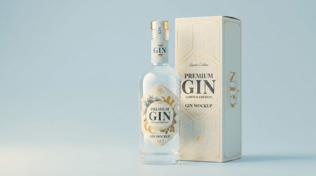
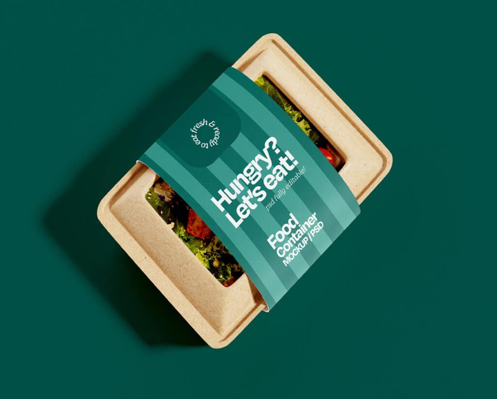
When choosing your custom packaging, make sure to factor in where you want your logo. Also consider what other information competes for space on that panel. If you also need a product name, a tagline, and a weight or quantity, the logo needs to share the space.
Some brands print the logo on multiple panels, including the sides and bottom. Others keep the front panel clean and put the logo on a side panel or inside the lid. There’s no single right or wrong answer. It depends on how your product is displayed and where customers will see the box.
Understanding dielines in the design process
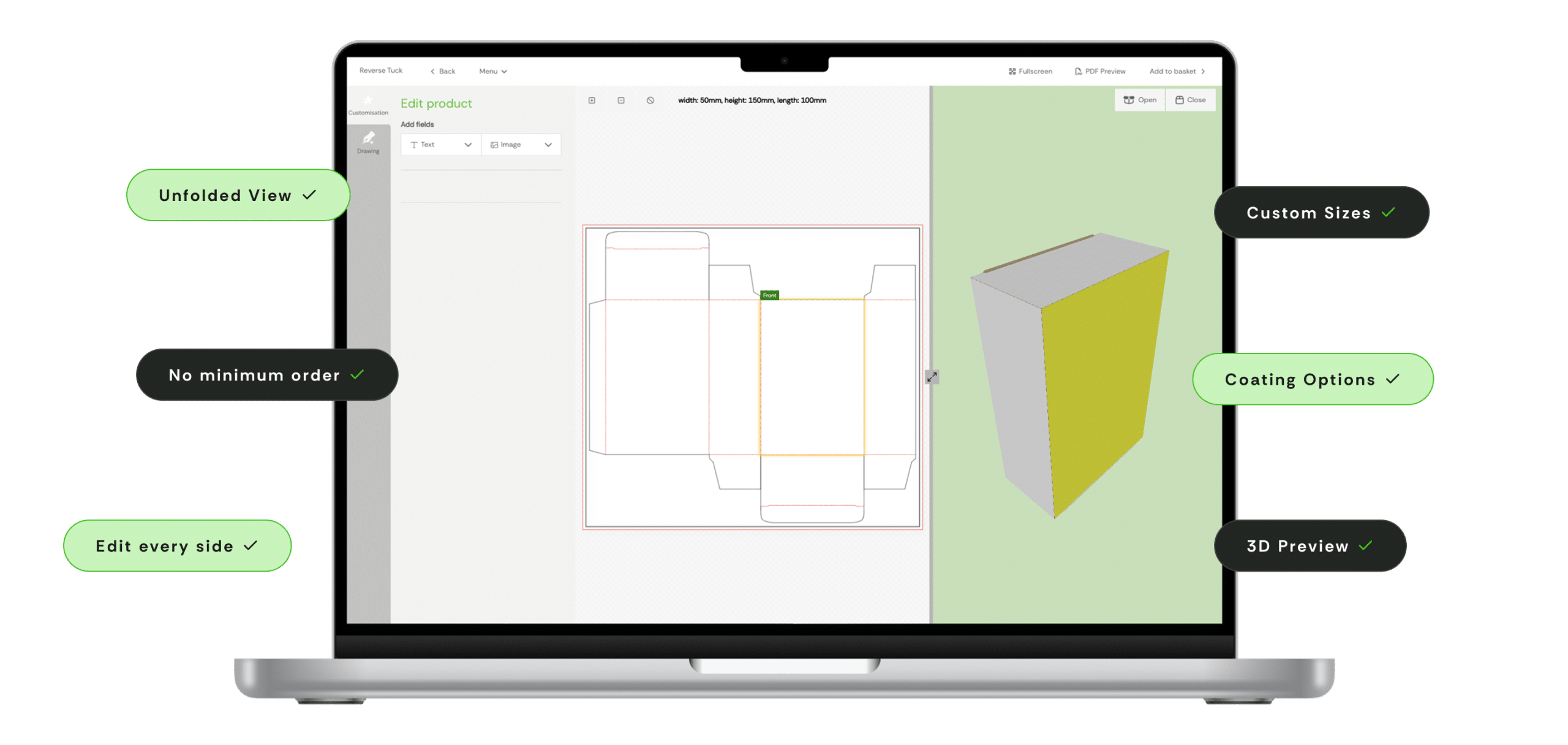
A dieline is the flat template of your box before it’s folded. It shows every panel, flap, fold line, and cut line laid out in two dimensions. When you design packaging artwork, you design it on the dieline.
If you’ve never seen a dieline before, it looks confusing. Panels appear in unexpected places. Some sections you need to work on upside down. Fold lines divide the template into sections, so you need to mentally fold together to understand which panel is which.
Your packaging supplier will create the dieline based on your box dimensions and style. You (or your designer) will then place artwork onto it. Most suppliers provide dielines as Adobe Illustrator or PDF files. Others offer online tools where you can design directly onto the template.
Key terms you’ll encounter:
- Trim line: where the card is cut in your packaging solution. Your design should not extend past this unless you want white edges.
- Bleed: artwork that extends slightly beyond the trim line (usually 3mm) to prevent white gaps if the cut is slightly off.
- Safe zone: the area inside the trim line where important text and logos should stay, so nothing gets cut off or falls too close to a fold.
If any of this feels overwhelming, that’s normal. A supplier who offers custom packaging in Glasgow with design support can walk you through the dieline and help you get your artwork placed correctly. We use an intuitive online design tool to make packaging design possible for everyone.
The unboxing experience for your target audience
People aren’t just buying things anymore, they are buying experiences. And for e-commerce and gift products, unboxing matters.
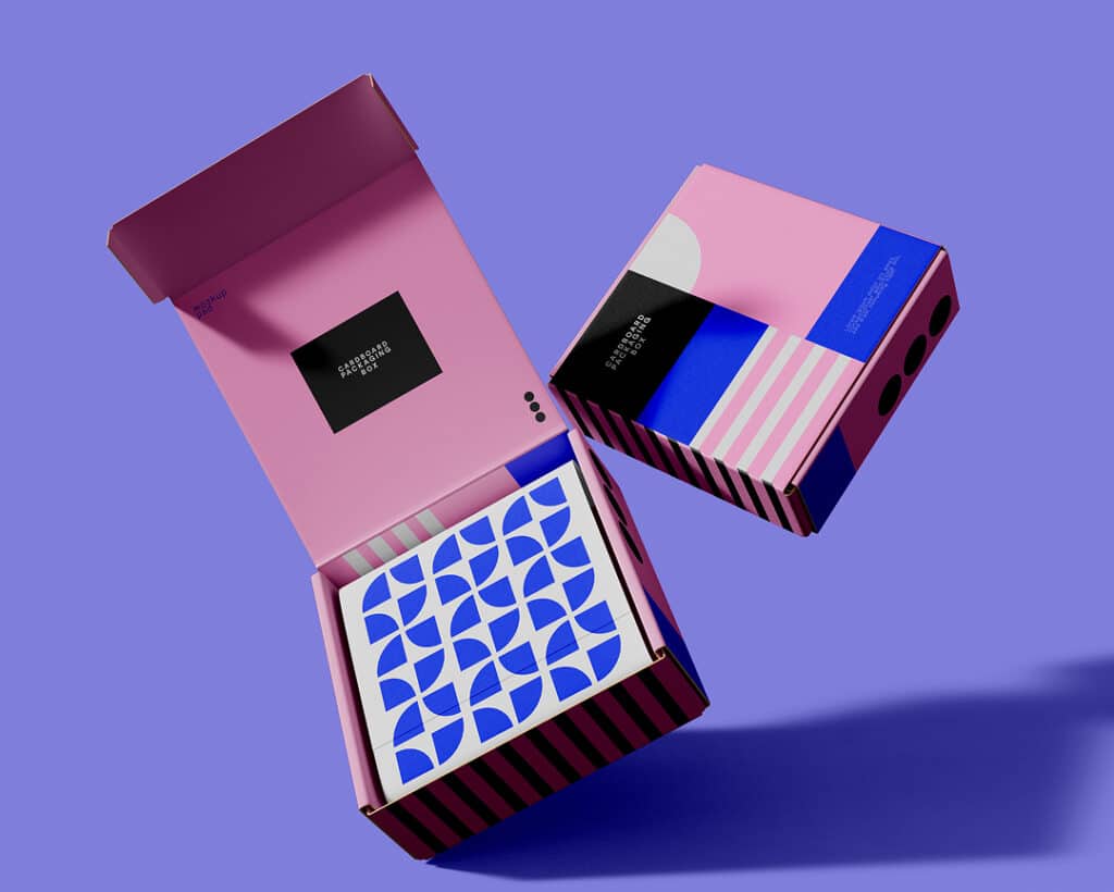
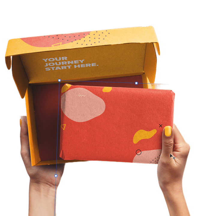
When a customer opens a mailer box, the inside lid is the first thing they see. For a memorable unboxing experience, using a print message, pattern, or brand colours can create a moment of surprise.
Inside printing adds cost, so weigh it against the impact. For subscription boxes and premium products, it can be worth the investment. For everyday items or regular products, added ink might be unnecessary.
Beyond printing, small touches add up.
Consider using branded tissue paper to wrap your product, adding a simple thank-you card or note, and even custom stickers to seal the tissue or close your box.
Think of this all as free marketing opportunities. When combined, they make a delivery into something worth sharing, either online or to their friends.
Contact Custom Pack Studio to design your packaging today
Reach out to our team today to learn more information on 01294 314919.